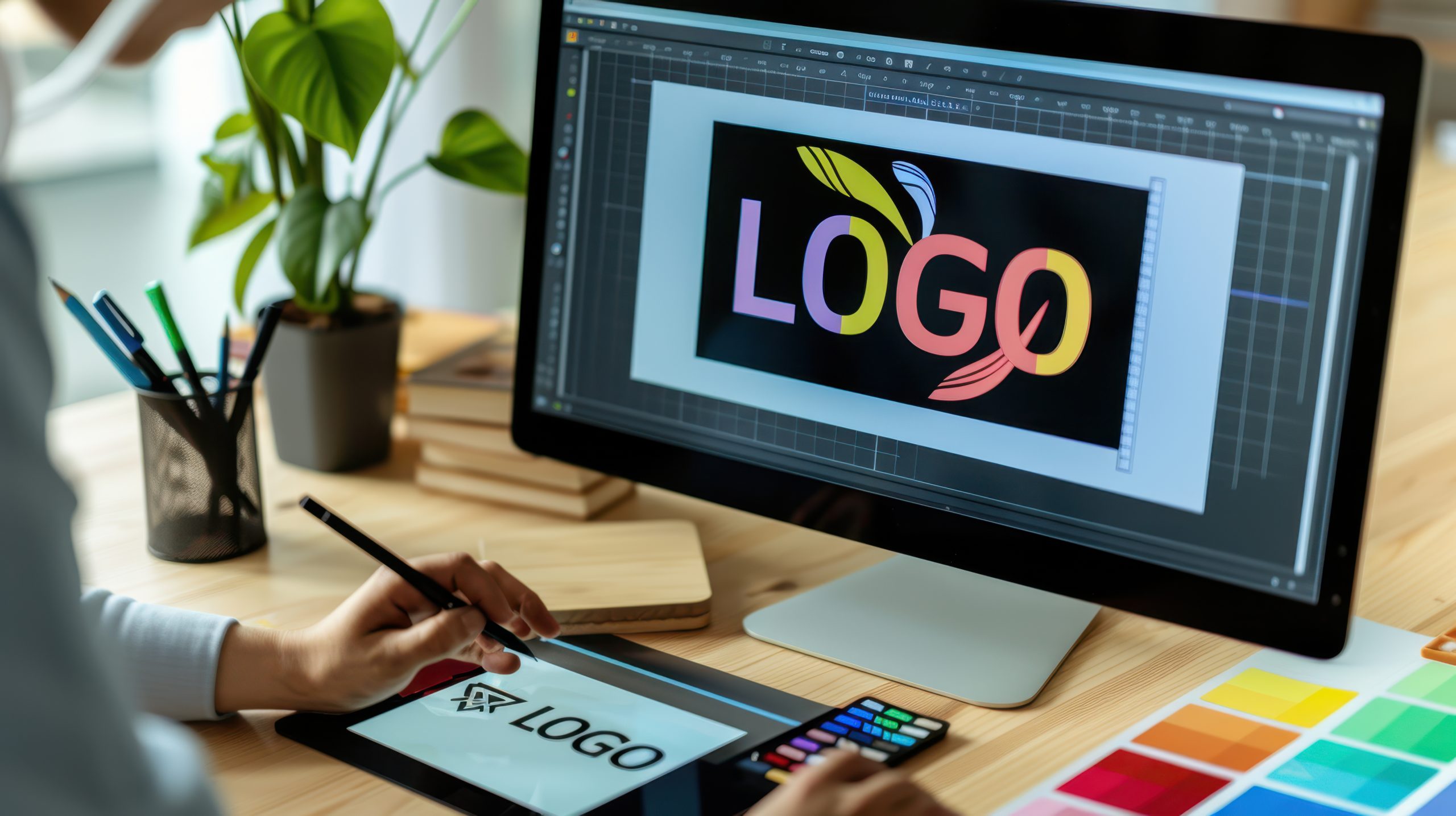
The Psychology Behind Effective Logo Design
A logo is not just a decorative graphic—it’s the visual anchor of your brand. It carries meaning, triggers emotions, and sets the tone for how people perceive your business. In today’s digital-first world, where impressions are made in seconds, your logo needs to do more than look good—it needs to communicate the soul of your brand.
So what makes some logos timeless and others forgettable? The answer lies in design psychology—the science of how visuals influence thoughts, emotions, and actions.
Why Psychological Design Matters
The moment a user sees your logo, their brain starts processing. Within milliseconds, they’re forming assumptions—consciously or not—about who you are. These assumptions are shaped by color, shape, font, and layout.
A strategically designed logo can:
- Build immediate trust
- Trigger curiosity or excitement
- Suggest credibility and professionalism
- Stick in a customer’s memory
When your logo resonates emotionally, people are more likely to remember your brand and engage with it.
1. The Influence of Color on Perception
Colors stir up emotions and play a vital role in how your brand is perceived. Each hue sends a specific message:
- Red: Energy, passion, urgency—common in food or retail
- Blue: Trust, calmness, security—popular in finance and tech
- Yellow: Optimism, friendliness, youthfulness
- Green: Health, nature, sustainability
- Black: Sophistication, luxury, authority
- Purple: Creativity, luxury, spirituality
2. Shapes and Their Subconscious Messages
Every shape has a psychological meaning—even if we don’t consciously recognize it.
- Circles and curves: Unity, harmony, friendliness
- Squares and rectangles: Stability, order, reliability
- Triangles: Movement, progress, innovation
Soft edges feel approachable; sharp angles feel bold and dynamic. Match the shape to your brand’s energy.
3. Fonts Reflect Personality
Fonts do more than spell your name—they reveal brand personality.
- Serif fonts: Traditional, trustworthy (e.g., law firms)
- Sans-serif fonts: Modern, clean (great for tech/startups)
- Script fonts: Elegant, creative, personal (often used in beauty or lifestyle brands)
- Bold fonts: Confident and strong
4. Simplicity Aids Memory
Simple logos are easier to remember and versatile for use in different formats—whether an app icon or a billboard.
Minimalist logos are:
- Easy to recognize
- Scalable and adaptable
- Uncluttered and modern
Think Apple or Nike—minimal yet powerful.
5. Emotional Branding is Key
Great logos stir emotions. It’s the feeling people get that makes them stay loyal or return.
For example:
- Healthcare brands = trust and care
- Creative brands = inspiration and imagination
- Luxury brands = desire and aspiration
Align your logo’s visual tone with your emotional branding goals.
Final Thoughts
Designing a logo is more than aesthetics—it’s about communicating the right message through psychology. Consider how your audience will feel, think, and react to every design decision.
Recap:
- Color: Triggers emotion
- Shape: Sets tone
- Font: Shows personality
- Simplicity: Ensures recall
- Emotion: Drives engagement
Get these right, and you’ll have a logo that’s not only beautiful—but unforgettable.


